Thursday 24 February 2011

Scarborough

I went to Scarborough for the day yesterday, basically for my independent project as I am specifically looking at journeys and those taken by train in conjunction with social interaction and the way in which people can interpret a lot about people on trains despite never even verbally communicating with them. This is something that I find quite interesting.

My course had been on a day trip to Scarborough the previous week for a bit of a bonding session, which I couldn't go to and whilst they were there had to capture the essence of Scarborough through photography or through video. So whilst I was there for a bit, I decided to take a pics on my Blackberry, so although they are not great quality, I did capture images of a few things that I thought was the essence of Scarborough.

Let me know what you think.....I thought there were lots of casino slot machines places as well as little cafes along the coast. The harbor had some really good potential shots had I had a better camera but I quite like how a few of my images have turned out despite them being taken on a Blackberry.......also seagulls there were loads of those! x


Tuesday 22 February 2011

My Pictograms in situ

Final Designs for Pictograms

Here are the final designs for my pictograms, in both black and white and the version with colour. In terms of the colour use, I decided to use pastel colours so that it was not too bright and bold but subtle colours. I wanted to use a different colour for each department to add distinction to each one, which I think is particularly useful for the subjects, which are homed in the same buildings on campus, to avoid the confusion that they are not part of the same department in terms of subjects. Some colours add to the clarity and understanding of the symbols, which I think has been beneficial for the communication of the departments. For Japanese, I have incorporated the flag into the design. The colour red had been used to highlight this, which I think works well in communicating that the subject is Japanese.

I have tried to make the set as unified as possible in terms of the design of the symbols representing each subject. I have used both straight and curved lines to bring depth and more of a quality to the designs, which can be seen through the progress of my development. I think this combination of curved and straight edges has made them look more professional particularly as they developed from the initial ideas.

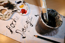
For each of the subjects, I found some much easier to communicate in terms of the choice of symbol to show the subject. However, there were some that were slightly more difficult to represent, including Spanish and also Design. For design I started off with the initial ideas of having a Mac computer as well as a pallet and paintbrush but this did not fit very well with the set having simply one symbol for each. I found this quite tricky trying to think of a single symbol that communicated design as a whole because of the many different aspects of it like graphics, fashion, product as well as art and design. I managed to come up with various tools that are associated with different design subjects, such as a pencil, paintbrush as well as a scalpel and this is the idea I went with. I tried to keep the designs as simple as possible so that the communication was clear to the audience.


Further Pictogram Development

I had a few different designs in terms of the actual symbol representing the subject of Spain. To begin with I had the fan and the castanets, which both represent Spain quite well in terms of its culture and traditions, particularly with the flamenco dancing. However, from the first feedback session it came to my attention that the fan symbol could also be used to represent Japanese as it is apart of their culture too. As well as that, having the two symbols together for the one subject did not link well with the rest of the set, which were each being associated with just the one symbol, such as the the calculator for mathematics, the helmet for history and the cylinder for chemistry.

So I decided to simply look into developing the castanets symbol. On testing it to see if people could tell what it by itself, knowing that it stood for a particular university department, it did not do so well at communicating the subject of Spanish. There was confusion with it perhaps being boxing gloves so presenting something to d with sports, so I then went on to look at a new design with a completely different symbol, which seemed to work much better at communicating the subject of Spanish.


Pictogram Development

Here are a few examples of the particular subjects I was designing pictograms for, including mathematics, history and chemistry. For each one I started off with the basic structure and shape of the designs using the colours black and white, as it was important that the symbols communicated the subject to the audience in the simplest of colour use. I then continued by introducing a colour to each of the subjects, in order to bring the element of distinction to each of the subjects. For the audience to recognise that each subject is represented by a different colour would bring about that distinction between each subject. However, the design of the symbols themselves with both curved as well as straight lines also introduced consistency to the set of subjects, which are all part of the University of Leeds.

From the ideas that I came up with, I found that the ones which stood out the most were the plain black background with the white symbol (no lines separating the symbol and background). This simple white on black or white on a specific colour worked well in terms of standing out and communicating each subject effectively to the audience. I then when on to further develop the pictograms in this style in both black and white as well as white with a specific colour representing each subject.


My Initial Pictograms for Project

Here is my initial set of pictograms for each of the subjects in question, Chemistry, Spanish, Design, Maths, History, Japanese, English and Engineering. As a set I think that they need to become more unified. After the first crit, it was seen that perhaps the use of the black, such as in the fan representing Spanish could act as a basis for part of the design which is apparent in each of the pictograms. I am going to see whether I can come up with a set of designs that fits this, thus making them appear more unified and part of a set all from the University of Leeds, as this is an important component for the designs.

It was apparent that the subjects were easily identifiable from the initial designs that I had produced. However, the importance of consistency came up with the fact that most of my pictograms are represented by one image, such as the book for English and the flag for Japanese. However, for Design and Spanish, perhaps the fact that I have used two objects this needed to be re addressed in order to tackle the problem and create the consistency within the set. The pictogram, which I created for history also needs re thinking because of the way I had included the years on the time line. Text should not be appearing and also the time line doesn't fit in with the other subjects being represented by single objects or representations.

More design also needs to arise because these initial ones I have done are quite basic but on a positive note they are communicating each of the subjects effectively. So adding and re working some of them is required and perhaps a little more thinking in terms of the design of others such as History and Design is also needed.

The Ocean Club Signage System

The graphic design consultancy The Kitchen, were faced with the dilemma of creating a signage system for people who could not see. It was commissioned to create this for Ocean, which is one of the largest music venues in London with a capacity of over 3000 and three auditoriums over four levels. I found this example of a signage system in “Mapping An Illustrated Guide to Graphic Navigational Systems” by Roger-Fawcett and William Owen. The Kitchen attempted to devise a system that was as restrained as possible, working all the signs into a square format produced in enamelled metal panels.

As you can see from the images, white backgrounds were applied to all of the signs bringing the element of consistency and also making the text stand out. This also made the signage easier to read and more legible. To create a design that was going to be suitable for a blind person, braille text was added to the bottom of each panel. I think that the placement of this is quite important and will have required a lot of thought and testing, particularly for blind people to be able to read it. By placing the embossed braille at the bottom of the panel, I think this would have made it more accessible as opposed to having to feel around the board. This will have been more convenient and saved time.