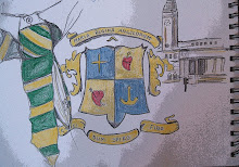


When I had a look at the careers fair taking place in the Parkinson building this week, I discovered the Marks in Time Exhibition. The exhibition is celebrating the role Marks and Spencer has played in people’s lives for 125 years. On display were many different things, such as rare documents, merchandise and also photography to name but a few. I found on the far walls of the exhibition some really eye-catching drawings with various interesting facts about Marks and Spencer such as its sales.
I think that the combination of drawing style and a colour for each one makes the information aesthetically pleasing and draws you in to want to read the fact that goes with it. For example the fact about bras 'if we lined up all our bras that M&S sell each year, it would reach the moon and back' is accompanied by a drawing of bras lined up in a row. I think this light hearted drawing style definitely makes the information more approachable.
The use of colour in this particular part of the exhibition separates the different facts and opinions, making it easier for the audience to understand and break up the information into individual pieces. You can read one piece of information and know that the next piece is unrelated and a completely fresh fact or opinion.
The final image I have shown is of customers opinions on their experiences of M&S and again this is in the same sort of style of drawing. The text is composed of various handwriting styles to give the audience the impression of different people airing their opinions. These different styles makes it more obvious that it is opinions of customers rather than facts. The exhibition had placed the facts on one wall and the opinions of customers on a separate wall in the room. Again, this will have made it easier for the audience to see what was fact and what was opinion.


No comments:
Post a Comment