Tuesday 26 October 2010

T-shirt designs


Here are some t-shirt designs I did for LSTV at uni
hmm what do you think?

My Route to University

I have designed my route to university without including any road names on the map. To show the way that I go to uni from my house each day, I have drawn the basic linear shape that I take by foot. This forms the basis of the route. There are also arrows on this line to show direction.

I have then incorporated various landmarks that particularly stick out for me on the journey. I have drawn the landmarks and positioned them along the route. I have shown the co-op, the school and the cup cake shop that I pass (Completely Wonderful), as well as different road signs such as the stop sign and also traffic lights. I have included the mosque because this is quite a major landmark in the Hyde Park area, which is identifiable and unique and I also see this on my walk in to university.

I have incorporated colour into the design of each of the landmarks to create an aesthetically pleasing map. I also think that the colour makes the information easier to understand for the audience trying to work out my route. I have included a key of this, which again brings about clarity and ease of understanding for the audience.

University Library: Edward Boyle - Floor plans

This year the library has had a makeover in terms of the layout as well as the introduction of signage around the library that states what you are and are not allowed to do in particular areas. So for example, on level 8 you are now allowed to eat and drink, talk on mobile phones as well as talk to others around you. This is identifiable on posters that highlight this as well as leaflets that you can pick up from level 9.

The group study area (level 8) use pictograms to show the audience that you can eat & drink, use a mobile and also have group discussion. These pictograms are designed in the same style and the use of the colour orange is also consistent in each one. As well as the pictograms and colour, the use of a tick symbol also shows the audience that the actions are allowed. For the pictograms in the silent study areas (level 10,11,12 &13), they are the same as those on level 8 but instead of the tick symbols there are cross symbols to show that the actions are prohibited. This can be seen in the images below.


Within the leaflet of the floor plans, there is a key that is clear and concise in its design. Consistency is visible throughout each design with the use of the black and white colours. Not only does this makes it more aesthetically pleasing for the audience but it also does not over complicate the design or create confusion for them. The simplicity is vital here because there is a lot of text within each floor plan anyway that show the different kinds of books and subjects. If the key contained even more text then I think the plans would contain too much information.


The designs for each floor are made up of flat 2d simple geometric forms, such as lines, squares and rectangles. This creates simplicity and order, which is what is needed for a map so that the audience can clearly see where they need to go and how they are going to get there. As well as the use of various shapes to identify different areas in the library, the use of colour is also used in conjunction with this.

Colour distinguishes between the silent study area and also the group study areas. Blue shows where the silent study areas are (on levels 10, 11,12 &13), whereas orange is used to show the group study areas (on level 8). The use of colour to distinguish between specific areas is also apparent on the floor plan of levels 9 and 10. The section for the books that can be loaned for 7 days stands out to the audience as it is in yellow on the map. The recently returned books, which can be seen on each floor, stand out and are coloured in green. Again, this is clear for the audience to see when looking at the plans because the colour is eye catching and stands out on the page for the audience.

The typography that is used in the leaflet is a clear sans serif typeface that is contemporary in its design as well as having legibility so that the audience can easily read it. The orientation of the design also adds to the ease of understanding because of the way the layout of each floor corresponds to the view you would have when you have just walked into the main entrance on level 9. This makes a lot of sense and so the audience would easily be able to find their way around the library.


City Guide: Maps of Paris & Florence

Acute Graphics Ltd created this map of Paris for RyanAir and as you can see, the design is simple and very clear to understand.

I think that in terms of the information provided on the map, there is a sufficient amount for the audience to comprehend where the major sites of attraction are within the city. The inclusion of the River Siene enables the audience to establish whether they want to be north or south of the river, which is a good starting point for them. The small scale at the bottom left showing the distance of 400 metres is also useful to the audience because being a tourist it is likely that the audience might be walking. This can help you to judge whether or not you are able to walk and so makes life easier for the audience.

By simply including major road names that the main tourist attractions are on, this keeps the information to a minimum. By naming all the roads that are on the map would certainly over complicate the design and contain too much information that the audience would not necessarily need to gain any further understanding of the map.

The images representing famous sites such as the Eiffel Tower add realism to the map, with their shapes corresponding to the real life versions. There also seems to be some sort of key with numbers contained in circles next to all of the sites. I think that the colours will be representing different types of sites such as places for recreation or for interest or maybe museums. I’m sure that in context this would make more sense, as Acute Graphics have created this for RyanAir. So perhaps RyanAir will have provided the information about the specific numbers and colours wherever they had placed this map, such as in a leaflet or information booklet on a plane.


I have also included another map Acute Graphics created for RyanAir but this time the map is of Florence in Italy. The same design style has been produced for this map just like the map of Paris for RyanAir. By maintaining consistency within their designs for the same company this shows professionalism from Acute Graphics and the RyanAir customers will also be able to see this.

Laser IT Box for A4 Paper

On this box are 4 pictograms, which each represent a different type of printer that the paper is suitable for printing with. In terms of the design of the pictograms the use of hue remains the same throughout. Black on the white background with the black box shape outlining the image keeps the design simple, so as not to complicate the design for the viewer. Also the use of other colours would be unnecessary in creating more of an understanding for the audience. Also the size and orientation of the pictograms has remained the same for all 4 designs, again for simplicity.

In terms of the shape, each of the designs is unique to the printer that it is representing. So for the laser printer, a lightening bolt is used and for a photocopier, the letter C is used on a sheet of paper. The inclusion of text along with the pictogram I feel is needed because I would not have known by simply looking at the images what they actually stood for. The text is clear and identifiable, with a simple modern sans serif typeface being used. Again, this stands out because of the bold black colour that the text is in.

The 4 pictograms stand out on the side of the box of A4 paper, which is a good thing. People can see straight away when they pick up or just look at the box whether the paper is suitable for their needs. They have been conveniently placed in order to make life easier for its target audience of paper buyers, particularly those who are going to use the paper in a variety of different printers.


Typefaces used by designers

After looking at a variety of sources online, I have found the typeface ‘Helvetica’ appears to be cropping up all the time as the most popular, influential and notorious typeface used by designers and particularly on the web.

One of the websites I looked at, InstantShift.com had a list of the top 21 more used fonts by professional designers. Out of the top 21, 14 of those were sans serifs and the top 4 were sans serifs too. Perhaps this shows the modernity and also readability of the sans serifs as opposed to the serifs typefaces, which are more elaborate and maybe regarded as less legible than sans serifs. It was ‘Helevetica’ that was placed at the top of this list of fonts.


Another piece of info graphics I found was based on the use of various typefaces and was set out as a periodic table, obviously with the chemical symbols being replaced by the typefaces. I found this a very interesting and clever piece of graphics and way of looking at use and popularity of different typefaces that exist now. It distinguished whether the font was a serif or sans serif and also who designed it and the year that it was designed. The number next to it was it’s ranking in the table of fonts. Again, ‘Helevetica’ came out on top. As well as other typefaces reappearing again and again, like ‘Futura’, ‘Gill Sans’ and ‘Univers’, all of which are sans serifs.


A piece of work by a graphic design student, Julian Hansen, has also captured my eye - “So you need a typeface”. It’s an alternative way of helping you choose a specific font for a particular piece of work you are going to start work on. He has been inspired by The Best 100 Fonts by FontShop and has based this piece on the top 50 in particular. Julian Hansen looked at a lot of different ways and contexts in which a font might be used and he has even mentioned info graphics. ‘Univers’ has been highlighted as an example of an infographic when wanting to create something very condensed. He has added humour into his work as well, which makes this piece even more eye catching because you want to follow on what he has written for each example. Other examples for infographics that he has included are ‘Letter Gothic’, ‘OCR’ and ‘FF DIN’.


I think, particularly in information graphics, designers want to create work that is going to aid the audience as opposed to create confusion. So a clear and concise typeface that is not only legible but also eye catching and easy to break down and read is vital. It appears from the research shown that sans serifs fit better into this category than serifs do.

"London Kerning"

“London Kerning” is a fantastic example of pure typography acting as info graphics. The information is taken from AZ street maps, where the icons, symbols and hard lines representing churches, streets, rivers and parks have been removed from the map, leaving only letters. Here you can see geography combining with creative design which is incredible and something different to the generic maps that we usually see.

The usual map typeface ‘Ariel narrow’ appears to have been used in this piece, which is clear and easy to read for an audience who want to know where they are going and be able to read the map quickly and efficiently. The sans serif typeface is certainly conventional to a map with its clarity and simple modern design. However, this piece is more about the visualisation of the information and people probably would not be using this to find their way around London. It is certainly and interesting design to look at by the way that you visualise the spaces yourself and work out where certain places are.

I think in terms of aesthetics this is a very stimulating piece of work, created by NB Studio in London. The typeface ‘Ariel narrow’ brings about a strong sense of clarity and understanding as opposed to confusing the audience with a more elaborate and complex typeface.

Blue Dragon Sachet and My own Design

Since the last lecture we had, I have started looking more at the way contents on food packaging is designed. Here is an example of the contents within a sachet of Blue Dragon Stir Fry Sauce. As you can see, there is no change in the design of this at all, the only change being the information for the specific contents. However, it does certainly tell you the facts straight and does not show the facts in a deceiving way, making you think that it is healthier than it actually is.

Here is my own redesign of the contents. I have looked at two of Bertin’s 6 retinal variables, orientation and also size. Each piece of information is within a square shape and the name of the contents is in a section at the top of the square, bringing consistency to the design.

I have changed the orientation by having the arrowhead pointing downward for a low % and pointing upwards for a high % for daily intake. For the calories I have changed the orientation of the shape so that the arrows are all around the square. This is because people may be more likely to look at calories, knowing that the daily intake is 1500 for women and 2000 for men. I have also made it stand out more by changing the size of the calories content to a larger one than the other contents of the sachet.


Thursday 14 October 2010

M&S Marks in Time Exhibition


When I had a look at the careers fair taking place in the Parkinson building this week, I discovered the Marks in Time Exhibition. The exhibition is celebrating the role Marks and Spencer has played in people’s lives for 125 years. On display were many different things, such as rare documents, merchandise and also photography to name but a few. I found on the far walls of the exhibition some really eye-catching drawings with various interesting facts about Marks and Spencer such as its sales.

I think that the combination of drawing style and a colour for each one makes the information aesthetically pleasing and draws you in to want to read the fact that goes with it. For example the fact about bras 'if we lined up all our bras that M&S sell each year, it would reach the moon and back' is accompanied by a drawing of bras lined up in a row. I think this light hearted drawing style definitely makes the information more approachable.

The use of colour in this particular part of the exhibition separates the different facts and opinions, making it easier for the audience to understand and break up the information into individual pieces. You can read one piece of information and know that the next piece is unrelated and a completely fresh fact or opinion.

The final image I have shown is of customers opinions on their experiences of M&S and again this is in the same sort of style of drawing. The text is composed of various handwriting styles to give the audience the impression of different people airing their opinions. These different styles makes it more obvious that it is opinions of customers rather than facts. The exhibition had placed the facts on one wall and the opinions of customers on a separate wall in the room. Again, this will have made it easier for the audience to see what was fact and what was opinion.

Tuesday 12 October 2010

Left vs Right


I found this work by David McCandless and Stefanie Posavec on the website Information is Beautiful. This piece of information graphics I think is highly visual. I was captured by the combination of image and text as well as the comparison between left and right. I do think there is a lot of information to take onboard here. However, I think that the layout and symmetry within the piece makes it aesthetically pleasing. I think the use of colour fits well the subject matter. As it is explaining the beliefs of each of the parties Labour and Conservative, red and blue respectively, this adds to the understanding for the audience rather than confusing them.

This piece could have been made less complicated by simply reducing the amount of text within it. However, maybe the audience would not have gained as full an understanding of the differences between the two parties. I think that the inclusion of arrows within the information helps with the reading of the text so the audience can see where to read next.

The World's Ten most Populated Metropolitan Areas


I found these examples of information graphics in the book ‘Graphic Design Sources’ by Kenneth J Hiebert. From these two pieces of information graphics, it is evident that each colour within the pie chart shape is representative of a particular year. However, I don’t think that this is noticeable straight away because from first glance I found the chart quite confusing. I think because the text was so small and the variety of different colours within each example made it appear more complicated than it actually is.

Perhaps colour is not needed to the extent it is used here. Maybe it is enough to have the lines for each year as a colour rather than the block of colour. It would not stand out at you full of colour detracting attention away from the information. I think the inclusion of the numbers showing the population in millions is needed because otherwise you would not have an idea of how particular countries have grown over the past 50 years.

It is also not very obvious from these two examples which countries have grown in population or become less. I think that this is perhaps why the information is displayed and comes across in a complex way. You still have to work it out for yourself rather than have the information simple and understandable in front of you. For example on the first one with the black as the background colour, Mexico City in 2000 was 25.6, in 1980 14.5 and in 1950 it does not appear because it was not in the top ten most populated metropolitan areas. This is not obvious from first look – you really have to study it to find out for yourself.

Simspons Banksy Intro


Banksy, well known for his graffiti painting has created an opening sequence for The Simpsons. I think it is a very funny minute and a half long piece. Others may find it controversial. In one scene there are hundreds and hundreds of workers in an industrial warehouse churning out scenes of animations, whilst kittens are being thrown into the wood chipper to make fur to put into cuddly toys of Bart. There is also a forlorn looking unicorn chained up and being used to punch centre holes in DVDs being made.

Banksy is trying to depict the animation process for the Fox cartoon series as sweatshop drudgery performed by an Asian underclass. I'm pretty sure that this wouldn't happen in real life but I think Banksy certainly got his teeth stuck into this project and let his creative juices flow. What do you think?

Monday 11 October 2010

Illustrated Boards

I have recently undertaken some freelance work for the PR branch of the company CARM Productions Ltd. I produced design boards, which formed the basis of a game designed to improve the communication skills of its participants, in particular their presentation skills. The boards featured illustrated designs of celebrities accompanied by facts, which teams were asked to remember and later give presentations on.

What the Tweet?

="

What the Tweet? from GOOD.is on Vimeo.

">


I found this video on Vimeo, which is about looking at what subjects people blog about and where these people get their sources from e.g. newspapers or magazines. It then does the same with twitter users. So what they tweet about along with the sources that they have got their information from. I found this quite confusing at first because all the information was being given to me far too quickly. I couldn’t take it all in at once, so I had to look at the video over and over a few times. I then started to see how it had been arranged and it started to make more sense to me.

At first we can see the sources of information and stories that people blog about. From the colour key at the bottom of the page, it is apparent that the majority of bloggers are influenced by the following sources: U.S Newspaper/Magazines, U.S Broadcast and International Broadcast. These three particularly stand out as showing the most colour on the diagram at the top of the page. It then informs us of the subjects that people blog about. From the layout of this shot, I assume that the larger the cutout for each subject, the more people blog about it. This shows that Politics/ Government is the most popular subject to blog about, followed my Foreign Affairs and then Science. I think that the images drawn to represent each subject are simple with no extra colour to add confusion. However, I am not sure that I would have realised what the subject was without the text being alongside it. In this case both are needed.

This is then repeated for the twitter users to find that the majority of these people get their resources from U.S Broadcast and U.S websites and tweet about technology. The comparison at the end makes it clearer what the information is trying to show but I certainly think there is far too much in the 50 seconds that the video last for. Perhaps the mixture between the key and colour use along with the pictograms for each of the subjects over complicates the design and detracts the attention away from the information. Maybe if it was more simplistic, less chaotic and had consistency, it would be easier to understand.

The Volunteers

"

The Volunteers from GOOD.is on Vimeo.

">

This is an example of a video of information graphics that I found on Vimeo about volunteering. It is showing the number of volunteers in 2009. It is unclear which country the information is specific to. Perhaps it is England or maybe America. From the information about the various organizations that people have been volunteering within, I think it is clearer that the country is America because of some of the American spellings e.g. organizational.

I think that the info in the video can be quite a lot to take in, particularly in the short time that it is on the screen for. The quick shots that show different organisations as well as age groups that have volunteered can be quite a lot to take onboard. Maybe more time for each set of information could have been allocated to the video. Also this is true for the large section of text at the beginning of the video giving an explanation of what the video is about. I didn’t read all of it because it had gone on to the next piece of info before I had time to finish reading it.

I think that the use of the people, which each represented 100,000 volunteers, was good as a visual representation because obviously the volunteers were people. However, perhaps the sheer scale of one person representing so many people was quite difficult to measure, particularly when only part of the person was there. It is quite difficult to judge exactly how much this may be as a figure. Perhaps text is needed here to clarify how many people it did represent.

Haiti Aid


I think that this piece of information graphics is very good at setting out the story of what it is explaining through the combination of both text and image. It is showing the support that was received from around the world – through January 19 – that has given $1 million or more.

The images are made up of shapes that remind me of those that you can produce using a spirograph, the geometric tool. Perhaps this was done because the information is telling us about figures and so the strong link to mathematics is displayed in the image.

The key that can be seen towards the bottom of the page highlights what the colours represent as well as the size of the circle shapes. If a larger amount of money was donated this corresponds to the circle being larger to represent this. However, the shapes do not really fit to scale in terms of the amount of money. You would expect that if two million dollars were donated then the shape would be twice the size of the one million dollar shape. This is where the key brings clarity along with the inclusion of the amounts within the diagram.

The key not only shows what each colour represents, but it also shows what amount the sizes of the shapes means. I think that the key does make it clearer to the audience that the shapes are not to scale of the amounts donated. I think that including the source of the donation along with the amount on each shape with text, this makes it much clearer for the audience to see who or where has donated what amount of aid.

Overall the design of this piece is highly visual with the use of colour and type, making it attractive to the eye. It is not too complicated and the key stands out by being highlighted within a box. It is set out simply so that you can get that information quick and easy rather than having to search for it.

There are also little drawings of parachutes dropping aid amongst the shapes, which reinforces the fact that the design is about the aid given to help the Haiti disaster. Infact, the shapes that contain the information about each donation are reminiscent of a bird’s eye view of a parachute (as if it is dropping aid). At first I did not pick up on this. But after looking more closely this design has cleverly been arranged and is understandable to its audience.

Information Symbol


I saw this symbol outside the train station at Leeds, where the information part is. There, you can obviously find out general info about the city and also get student bus passes etc. I think that this symbol is recognisable to most people, that it means information. If you have just arrived new into a city and are walking out of the train station you will be looking for something to tell you where to go or what to do. I think that this is the symbol you want to find.

The white ‘i’ symbol on a blue background has become internationally recognized as that of information. Even in places like Japan, the use of the letter ‘i’ is apparent and people know what it means. I think this is especially useful for visitors who do not understand the Japanese language, which they would find confusing.

Train Station Symbols


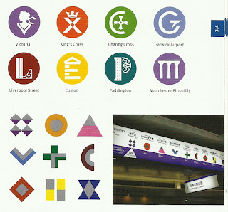
Here are some examples of train station pictograms that I found in ‘The Wayfinding Handbook’ by David Gibson. The first set is representations of various stations in England, such as Charing Cross in London and Piccadilly station in Manchester. The family of symbols reinforces the unique name and special historic character of the major British railroad signs. These symbols appear on signage, publications and maps.

I was immediately drawn to them because of the vibrant use of colours to signify each of the stations. I think that the simple use of one colour with the white colour to distinguish the pictogram works quite well in terms of aesthetics. However, in terms of a piece of informative design, I think that the colours for each symbol are not needed to make the pictograms more understandable. If the circular shapes for all of them were the colour black, so that each one was in black and white, I think this would be enough for the audience to understand which station is which.

Each pictogram is specific to the station it represents, so for example with Victoria station, the pictogram is clearly of Queen Victoria’s head. Even the letter V has been incorporated into the image as the neckline of her garment. The first letter of each station is evident within each pictogram through a simple design, which also links well with the destination. Another example is of Gatwick Airport, where the letter G is clearly visible. The horizontal line to finish off the G is also representative of the wing of an aeroplane, which again is a clever design.

The next set of symbols was created for the stations of Aichi Rapid Transit’s Linimo line in Japan. They too are very distinctive and help travelers identify the various stations on the line.

Again, with these symbols, the use of colour helps in distinguishing between each one. However, because the shapes of each symbol are very different, I think that if the symbols were just in black and white, the audience of travelers would still be able to understand which one is which. The colours do create aesthetically pleasing symbols that add more distinction between each one.

As this line is situated in Japan where there are a lot of travelers and people who do not understand Japanese, I think that the symbols are particularly useful for these people. If you can see the photo of the symbols in situ on a sign in a station, you will be able to see the Japanese writing above them. I think without these symbols, it would be very difficult for a traveler to be able to tell which stop to get off at and understand which station is which. In terms of a piece of information design, I think the symbols are very successful in doing their job of informing and making life easier for people.

Election 2010 BBC News Website


I remember looking at this map back when the elections were on in May this year. I think that it was very useful in not only showing how the voting had gone throughout the country and different constituencies but it was also interactive. It allowed you to set the parties vote share by clicking and dragging the small arrows surrounding the chart. So you could see for yourself who may have won the election if for example you gave the Liberal Democrats a higher proportion of the votes.

By moving the cursor this altered the House of Commons seats and so showed what the outcome would be depending on how you moved the cursors for the vote share. The use of colour to distinguish between the different parties makes it clearer for the audience to understand, which party is which, as well as making it aesthetically pleasing.

I think the inclusion of text with the graphics is important here because if it did not have anything written with it, you would not know that you could move the cursors to change the parties’ vote share. Over the cursors there is a box with the text ‘click and drag to set the parties’ share of the vote’. It stands out from the rest of the text, which I think is particularly noticeable to the audience.

Five Ways to Use Nasal Spray


I found this example of five ways to use a nasal spray in the book ‘Open Here – The Art of Instructional Design’ by Paul Mijksenaar and Piet Westendorp. Each example is basically telling the audience the same information but through five dialects of graphic language.

I think that with this kind of pictogram colour does not add to the understanding of how to use the nasal spray. So perhaps with the last set of infographics the colours are not really needed. I don’t think that the colour makes the images easier to understand in any way. I think that the use of the black and white colours in the first four examples is better because they are simple and do not confuse the audience by adding unnecessary colour.

The use of the arrows to show the direction of movement, particularly in the first two examples shows how to use the nasal spray without the need for text to reinforce the image.
It is interesting to be able to look at various infographics, which are all quite different in their design but which have the same purpose like showing how to use nasal spray. There is not just one way of explaining a particular instruction or command, so there is a lot of room to explore different creative styles.

Instructions for Printer Set-up


I’ve just bought a new printer and found the instruction manual for how to set it up a clear and simple example to follow. At first glance, I had to stop and think, as there was no text accompanying any of the images. The step-by-step guide was coherent with steps numbered one to nine, as well as having steps within some of the sections like in section one.
This guide did not need text; the images were enough to inform the audience of how to set it up. Each step is also easily identifiable with the rectangular strips separating, which again helps to clearly define each step.
I found that the accurate use of colour, which coincided with the actual printer colours as well as the cartridge colours, sped up the process of the set up with no confusion.

The use of arrows to show direction within the images, such as in the first step when taking the tape off the printer adds to the clarity of the guide. The circles with arrows, which show a zoomed in version of part of an image, also reinforce and further explain how to set up the printer in an easy to understand way.

Through the use of just images, the guide also clearly shows warnings of what not to do with the use of the symbol like a ‘no entry’ sign. By placing that over an image in step 6 we know not to do that. Another clever symbol used within the guide is the egg timer along with a 30 second image underneath it. I immediately understood that this meant that you had to wait for thirty seconds for this process to take place.

I think that this guide cleverly uses image and symbols to inform the audience of how to set up the printer without having any text. Including text would have been unnecessary in this case.